Redesigning Jio Enterprise Web
Application’s Navigation for Better
Feature Discoverability
Let me take you through my process of redesigning side navigation panel of JioWorks, a work management tool
My Role
I led the redesign of the side navigation for Jio Enterprise's web apps, focusing on understanding unmet user needs and collaborating with stakeholders.
Team
I worked with the Jio Enterprise Team (JET) for over a year, contributing to two products before this project.
Introduction
As a product designer, I was assigned to tackle inconsistent web app navigation across Jio Enterprise Team (JET) products. Inconsistency was primarily because of two reasons
Problem No. 1
There were no guidelines around web application’s navigation because design system was in nascent stage.
Problem No. 2
Different designers designed dissimilar products in separate timelines.
As JET aimed to market their products as a bouquet of services, consistent navigation
became crucial.
Understanding More About Problem
To understand problem more clearly lets see layout of JET products
240 PX
80 PX
12 PX
Main content area
1084 PX
12 PX
Header
1440 PX
768 PX
Second
Navigation
Panel
First
Navigation
Panel
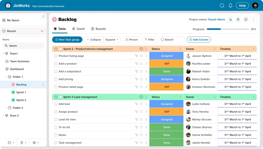
The JioEnterprise product screen has a two-panel navigation layout. The first level of navigation is in one panel, and the second level appears in a separate panel. Both of these panels are not collapsible.
Note
While redesigning navigation, I took all products and their use cases with the help of respective product managers and designers, but going forward, for ease of understanding and explanation of this case study, we will take the example of JioWorks.
JioWorks Screen
Problem No. 1
The navigation is split into two panels, but it's not clear which menus need the second panel. This inconsistency wastes space and leaves less room for the main content.
Problem No. 2
The panels can’t be collapsed. This might help new users explore, but it distracts experienced users by taking up unnecessary space.
Problem No. 3
Even longtime users missed important features because they were hidden in confusing places, making it hard to find and add new features.
Problem No. 4
Whenever a new product or navigation change was needed, designers had to start from scratch, with no reusable components or guidelines, leading to inconsistent designs.
Solution
By solving above problems we wanted to improve two business metrics-
Increase Engagement
by increasing discoverability of features and consistency of navigation across all JET products.
Increase Agility
by decreasing time put by design team in changing or making a new navigation of new or existing product.
To get ahead let’s finalise few terms which I will frequently use in case study-
Home
The Home is entrance scene of the platform. It introduces the app and its navigation
Parent and Child
A higher level of navigation hierarchy is called a parent, and the level (or levels) below are referred as children
Sibling
Scenes that have the same parent are called sibling.
Collection
Collection include multiple scenes
Merging Two Panel to One
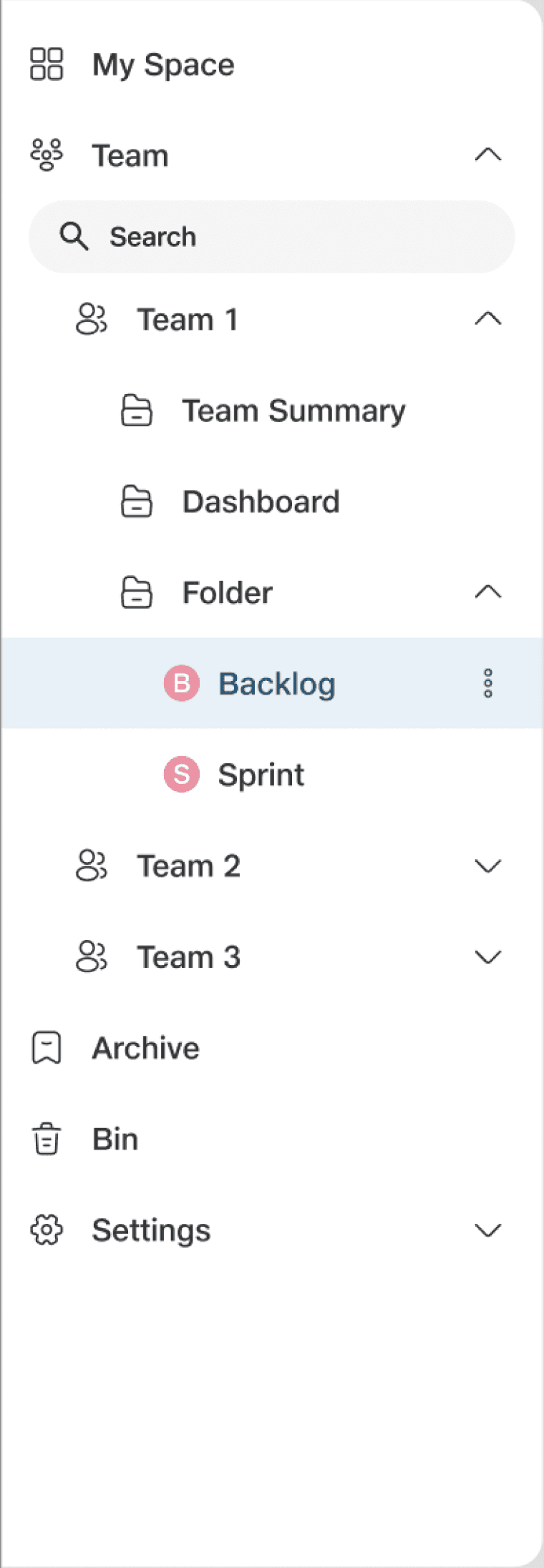
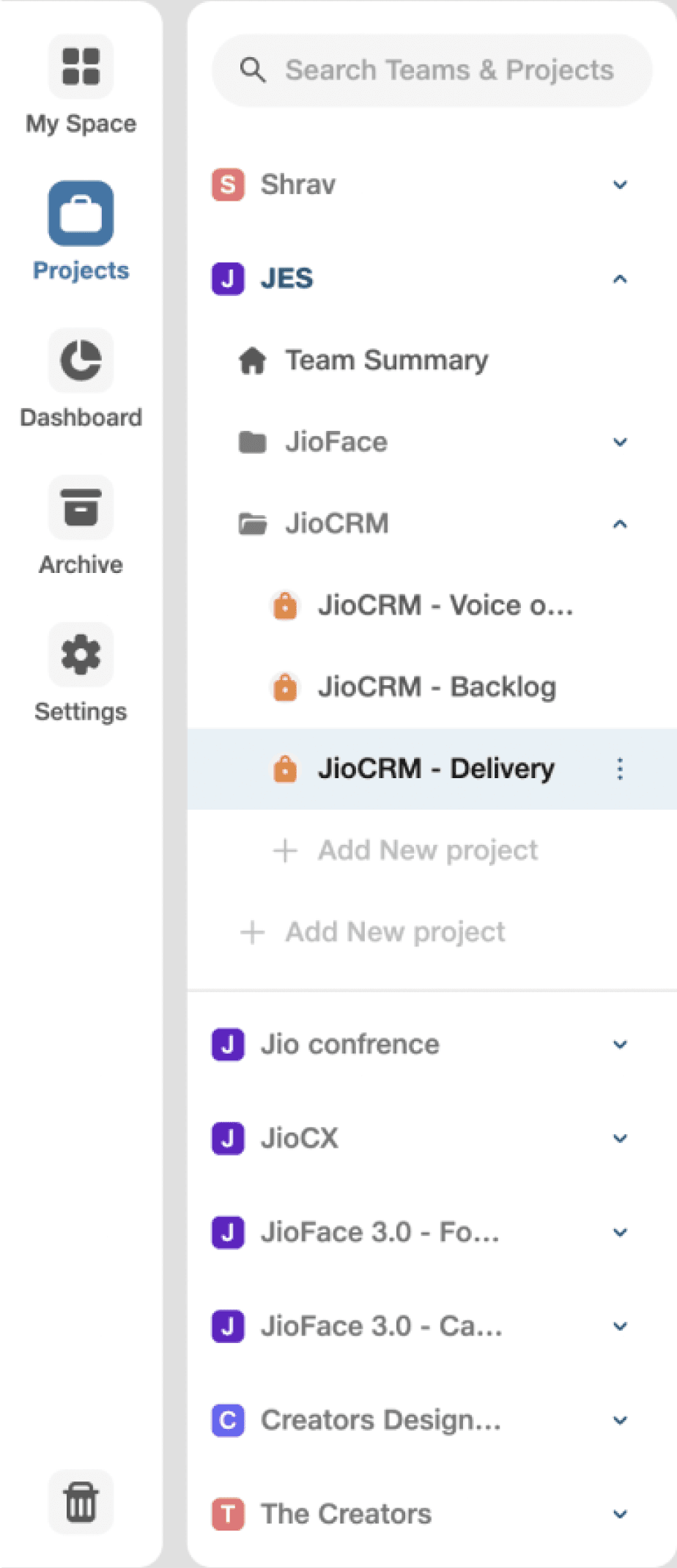
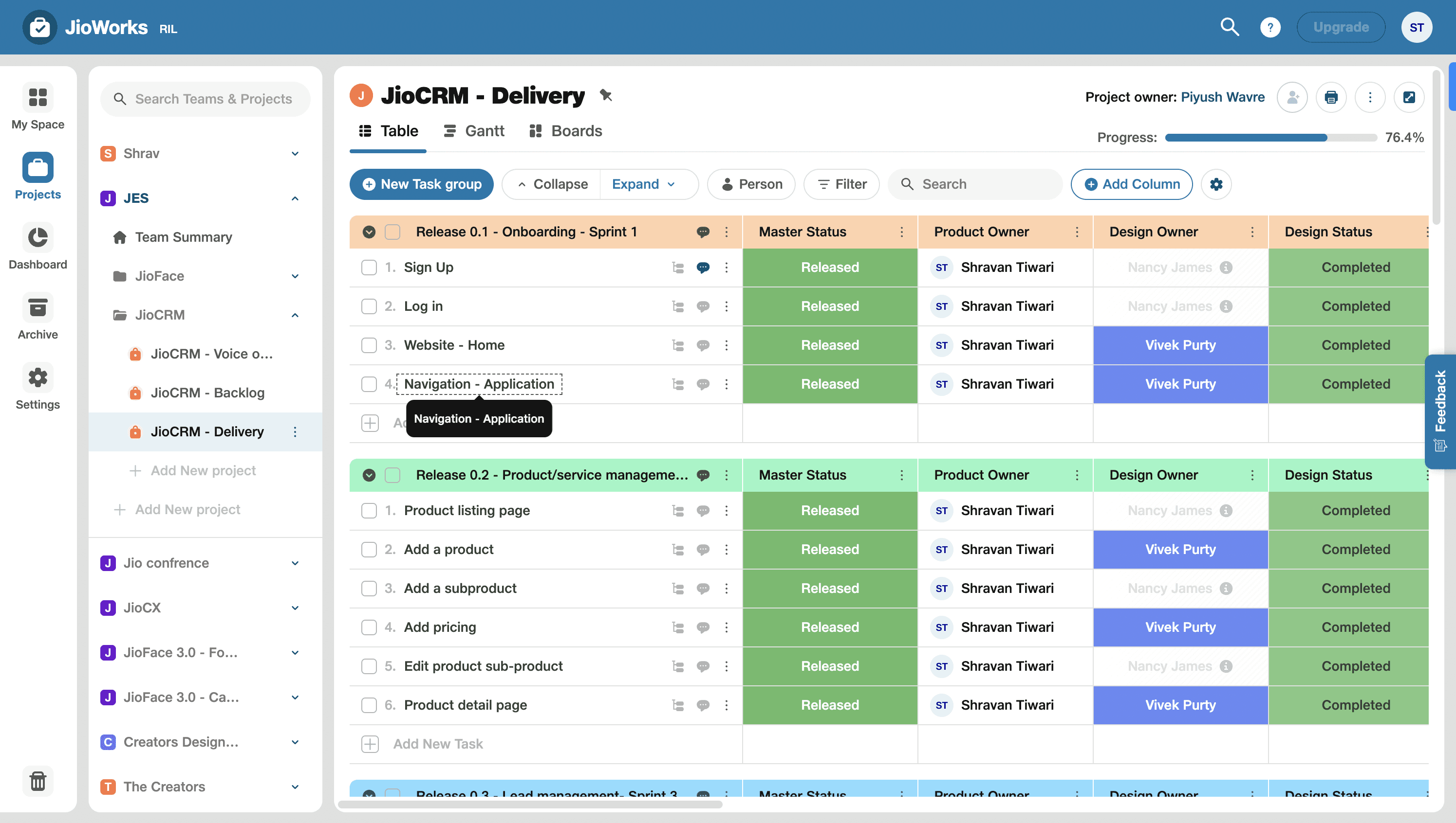
Merging two panel to one
We want to convert this to
Something like this
This whole panel is made up with small elements. We will call them as Navigational element
Navigation Elements
My Space
Team
Team 1
Team Summary
Dashboard
Folder
B
Backlog
S
Sprint
Team 2
Team 3
Archive
Bin
Settings

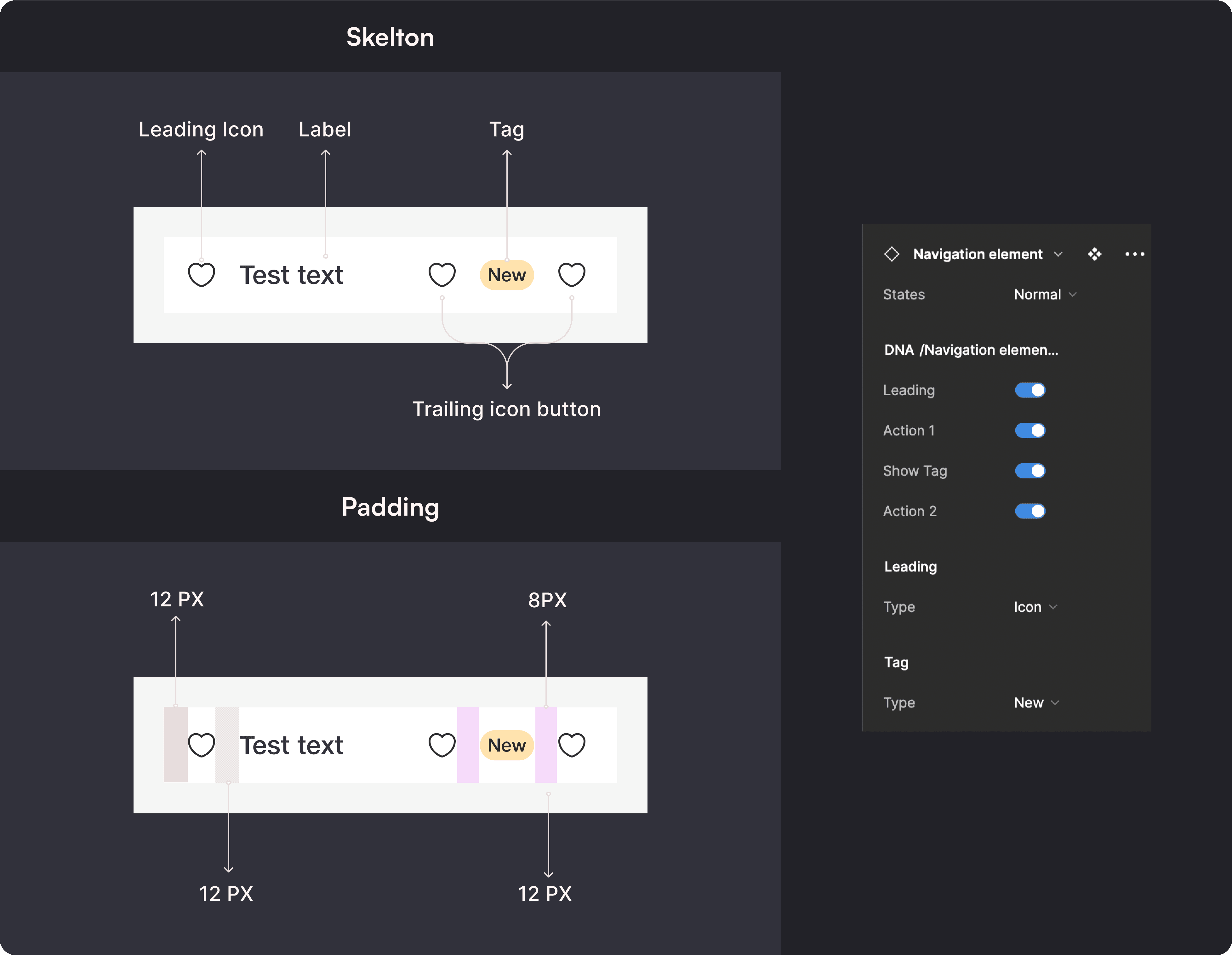
This navigation element has three states, and various variants. I gathered all use case and made a component, named “Navigation element”, so that it can be reused.
Iteration 1
Navigation Element
Navigation element will be used as basic element in navigation panel. it compasses leading icon, Label and trailing action item.
Test text
New
Test text
New
Test text
New
Test text
20+
Test text
20+
Test text
20+
Normal
Hover
Selected
With Tag
With Number
Anatomy of Component
This component is divided in 3 parts:Leading, label, and trailing.
Application on JioWorks
Before applying new Navigation element component on Nav panel, i once again sat down with PMs and Designers of JioWorks and tried to understand the whole structure of product. I found 2 kew things
Teams don’t come inside projects, projects come inside Teams. It is in following hierarchy
Dashboard is related to a particular team and can be combined with team.
Team
Folder
Project
Task Group
Task
Project
Folder
Team
Task Group
Task
Not Managed in navigation panel
Level 1
Current Flow
Suggested Flow
Level 2
Level 3
Level 4
Level 5
By understanding, all this i applied new navigation in JioWorks, and went on to show it to few users and stakeholders to gather feedback. My space act as a home for JioWorks
Feedback from Users and Stakeholder
Lack of Grouping
There were no guidelines around web application’s navigation because design system was in nascent stage.
Search in Groups
Some groups need search functionality, while others do not
Hierarchy Confusion
The hierarchy in the team section isn't clear. Teams have a variable number of sublevels, while settings have a fixed number, so they should be displayed differently.
Designer Confusion
Designers were unsure how to create level 2 and 3 navigation using the existing components.
Iteration 2
Grouping the Menus
Designing a new navigation pattern turned out to be more complex than I initially expected. I thought it would be a two-step process, but after getting feedback and my own analysis, I found many underlying issues. First thing first, I once again sat down with PMs and designers of JioWorks and asked two questions-
1. Which menu in the navigation panel feels like they belong together?
Are there any redundant menus that might be easily merged or simplified?
After reflecting on feedback and my analysis, I started researching web apps and systems that show multiple levels of parent and child levels and that child elements are not constant.
I found the use of chevron in Mac's file management system quite interesting.
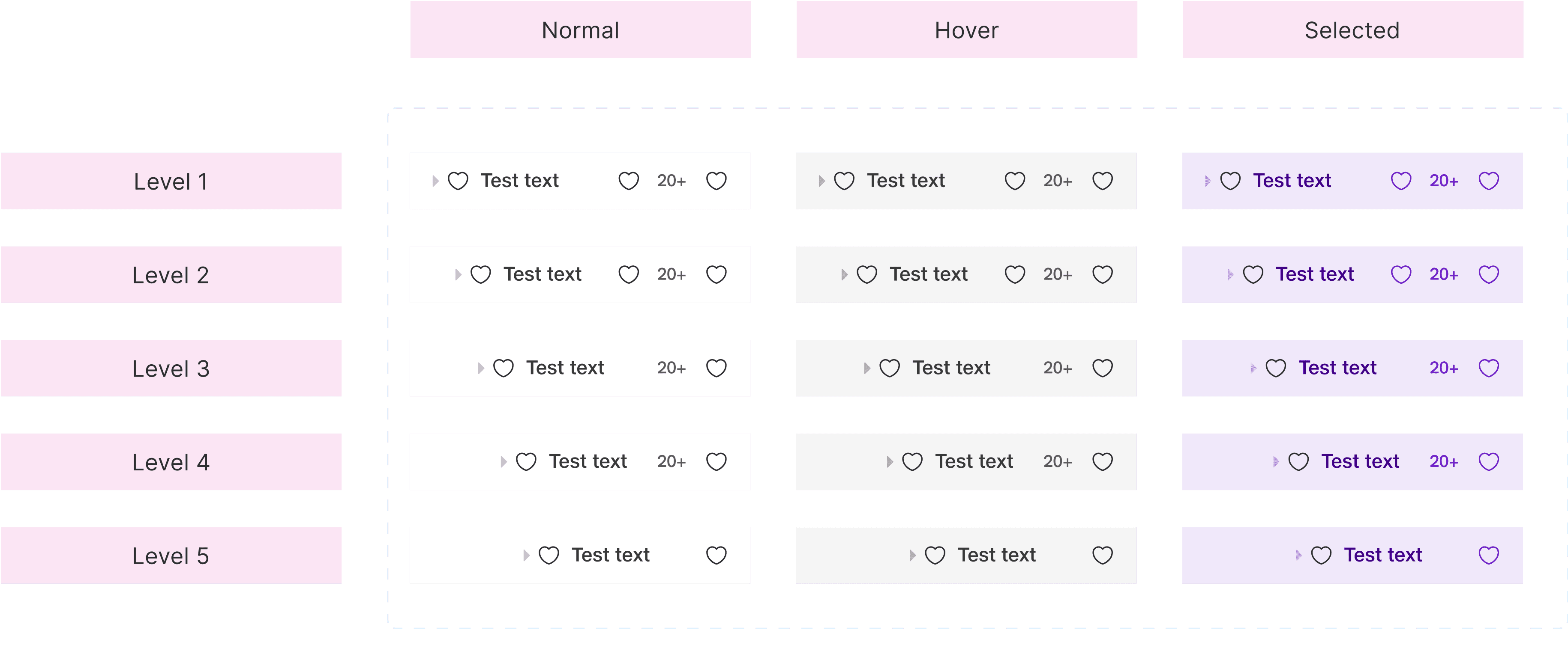
With taking inspiration from this I redesigned Navigation element component. To avoid confusion among designers, I renamed the 'Navigation element component' to a more intuitive term,
'Nav Bar Menu’.
Navigation Menu
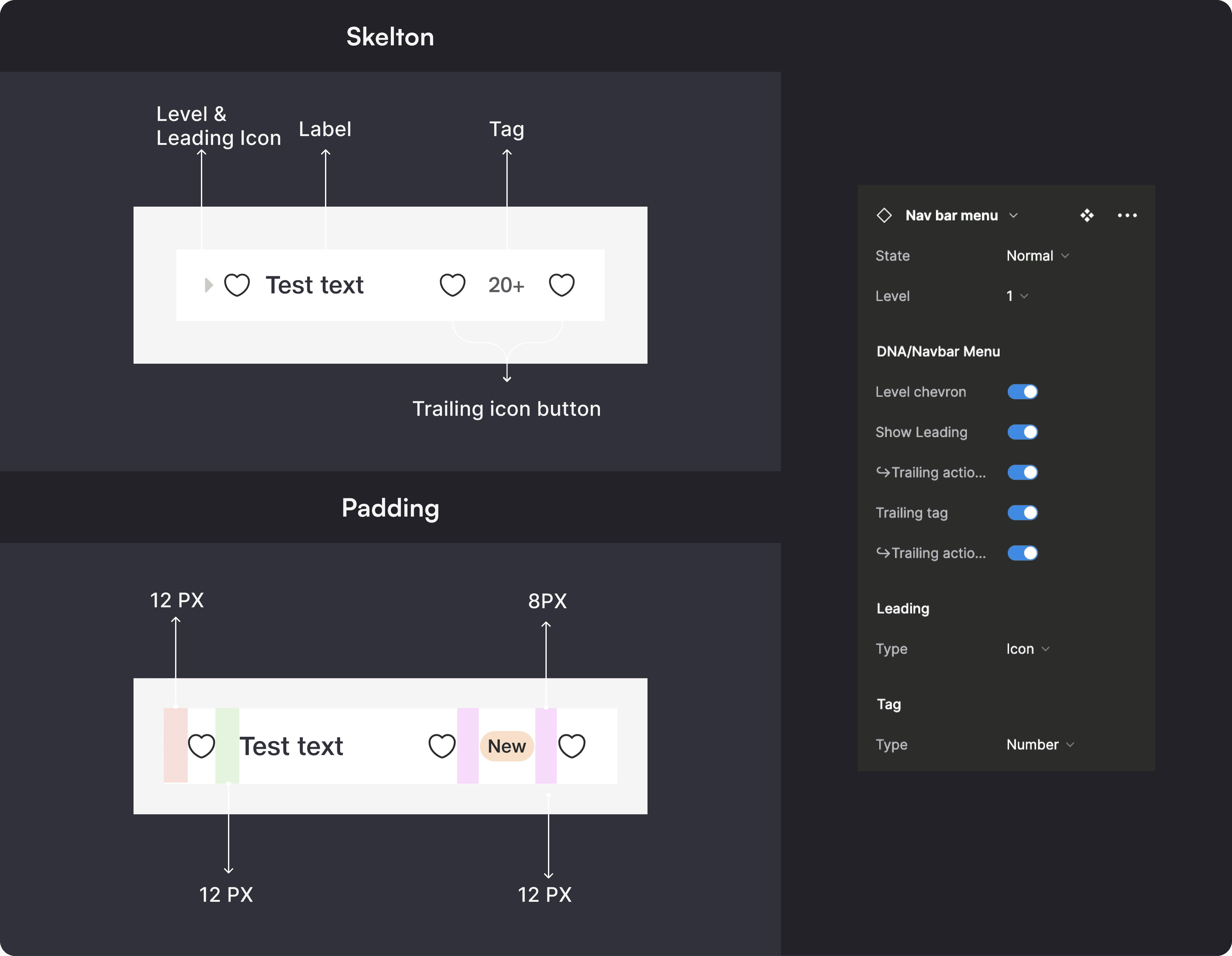
Navigation menu will be used as basic element in navigation panel. It compasses level icon, leading icon, Label and trailing action item.
Anatomy of Component
This component is divided in 3 parts:Leading, label, and trailing. Leading part have a level icon which can be used to show different levels.
Now, since in earlier iteration there were two problem -
Grouping of menus was not there.
Designers were not able to understand how to use “Navigation element” component while showing levels.
To solve these problems I also made a component named as “Navigation Menu Group” using Nav bar menu.
Navigation Menu Group
Navigation menu group component is made to help designers in making obvious grouping inside navigation panel. Designers can use it with or without search and headers
With search and header
Section
Search
Test text
20+
Test text
20+
Test text
20+
With header
Section
Test text
20+
Test text
20+
Test text
20+
Without header
Test text
20+
Test text
20+
Test text
20+
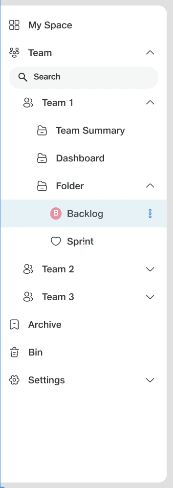
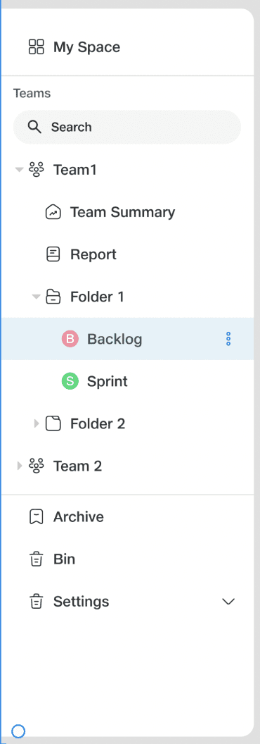
After application of New Component
Iteration 3
Managing Bottom Part
Bottom part of above panel is empty which is making whole design unbalanced. It can be used to put secondary menu options which are less frequently used. So, I made new component for bottom part by listing down all cases which can be possible.
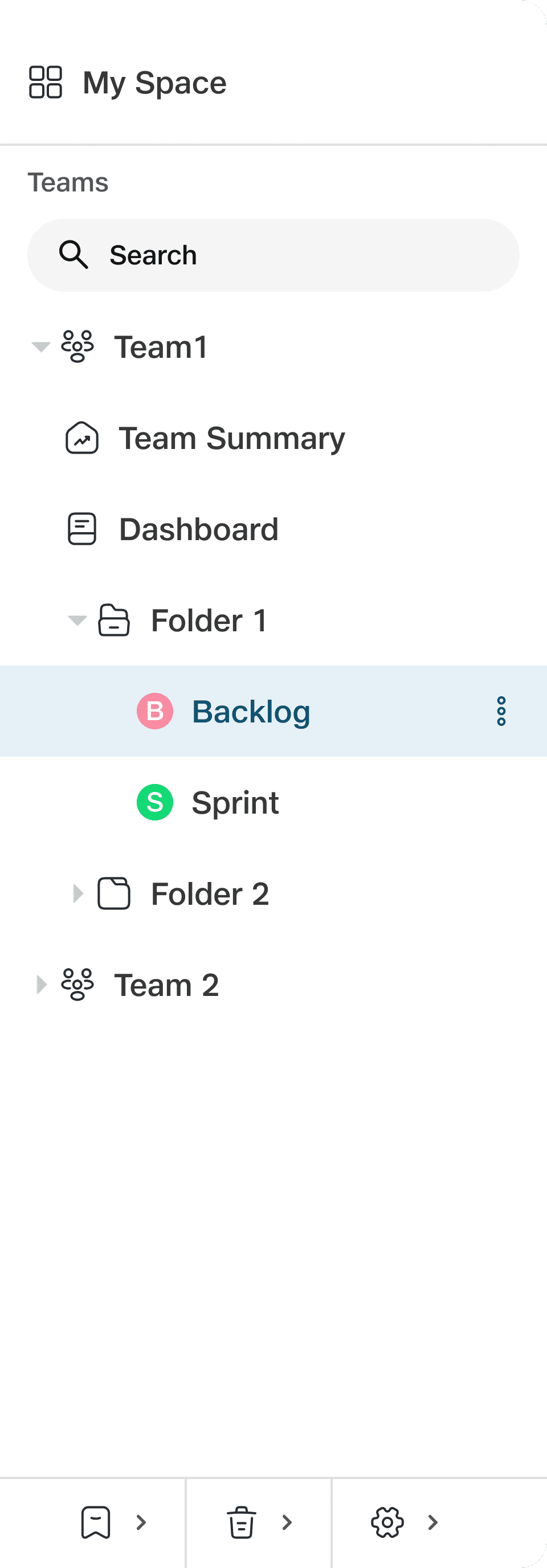
Bottom Part
Test Text
Test Text
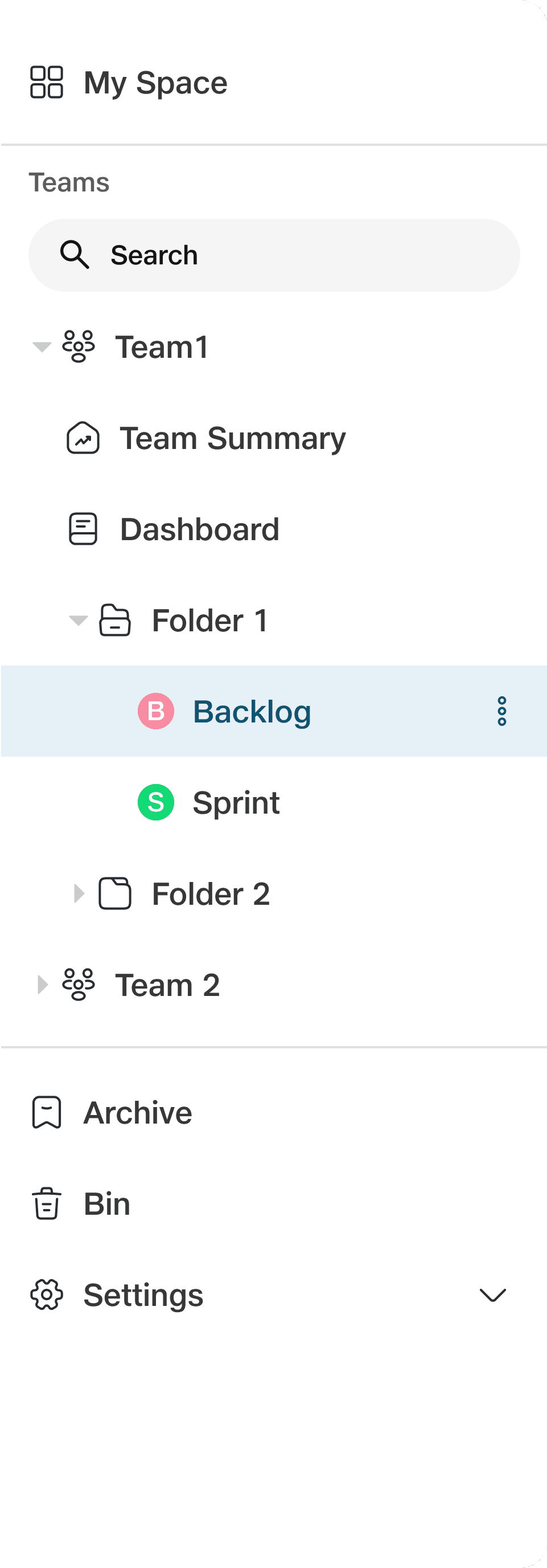
Application on JioWorks
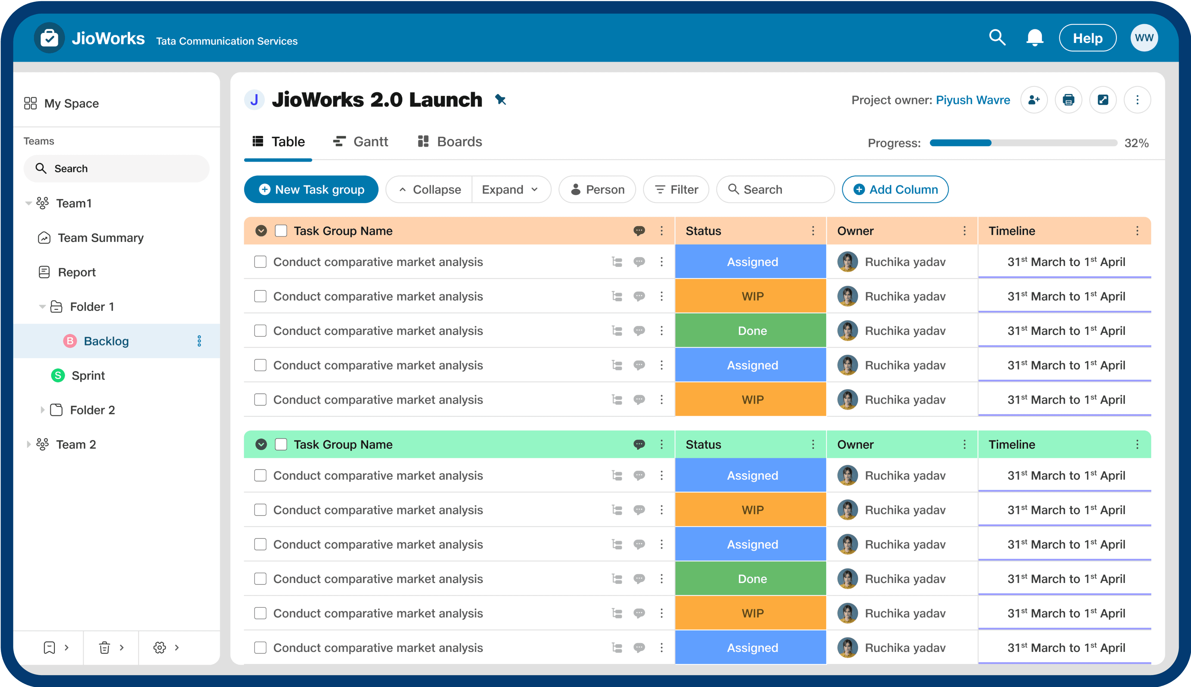
Speacial Case
Simplifying Settings
Our users struggled to find the settings option in the current JET products, especially JioWorks. This was due to the overwhelming number of settings options and their placement in the side navigation panel.
So, we put settings in the bottom part and kept all child options in the main panel. We also used breadcrumbs to increase the "you are here indicator."
Speacial Case
Navigating Quickly
I also found that users multiple times visit the same pages in one activity session. So, I added a Recent menu to quickly navigate to recently visited pages. A pro user’s workflow will become fast by adding a feature like this.
Making Navigation Bar Collapsible
After many iterations, I created three options to show all stakeholder and designer keeping in mind both- our use cases and external consistensy. I also told them their pros and cons so that they can make an informed choice.
Iteration 1
In this option, the side panel does not present any option after collapsing, just a chevron to open it up again.
Pros- Very good for focussed work.
Cons- If the user needs to change between menus, they must expand the nav bar; only then can they choose a new option.
Iteration 2
In this option, the side panel does not present any option after collapsing, just a chevron to open it up again.
Pros- Very good for focussed work.
Cons- If the user needs to change between menus, they must expand the nav bar; only then can they choose a new option.
Iteration 3
In this option, when the user hovers over any menu in side navigation bar in a collapsed state, it gives menus' name in tooltip. On clicking over menu it gives all child menus inside it in a floating box.
Pros- It presents only those options which are needed. If user clicks on "Teams" menu in collapsed side navigation bar, it means they want to see options inside it only.
Cons- Discoverability is less in this option than option 2.
Finally iteration 3 got selected and then we showed it some of our users. The response was awesome and they loved it. Now, see JioWorks navigation in its full glory-
JioWorks
JioCX
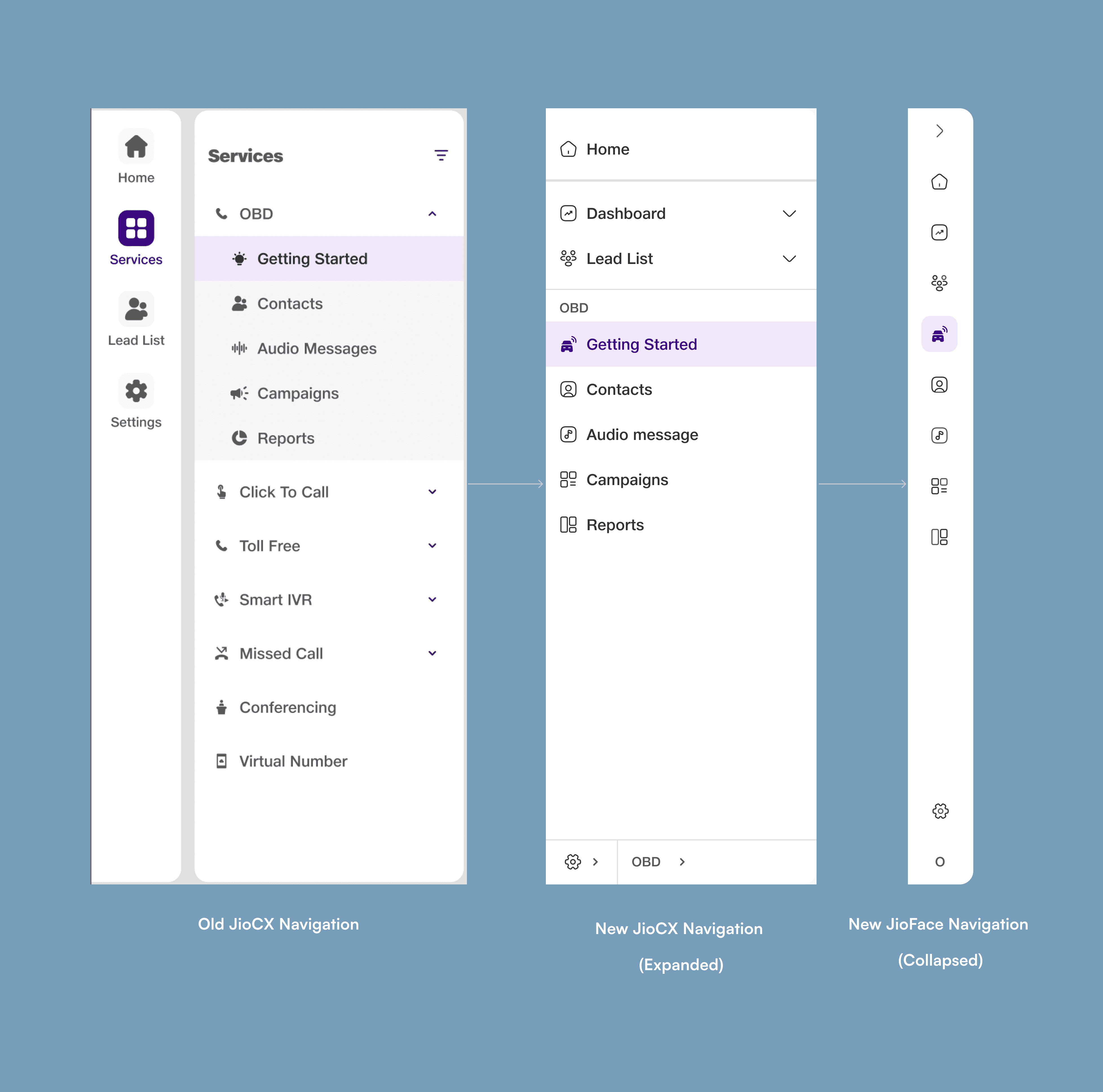
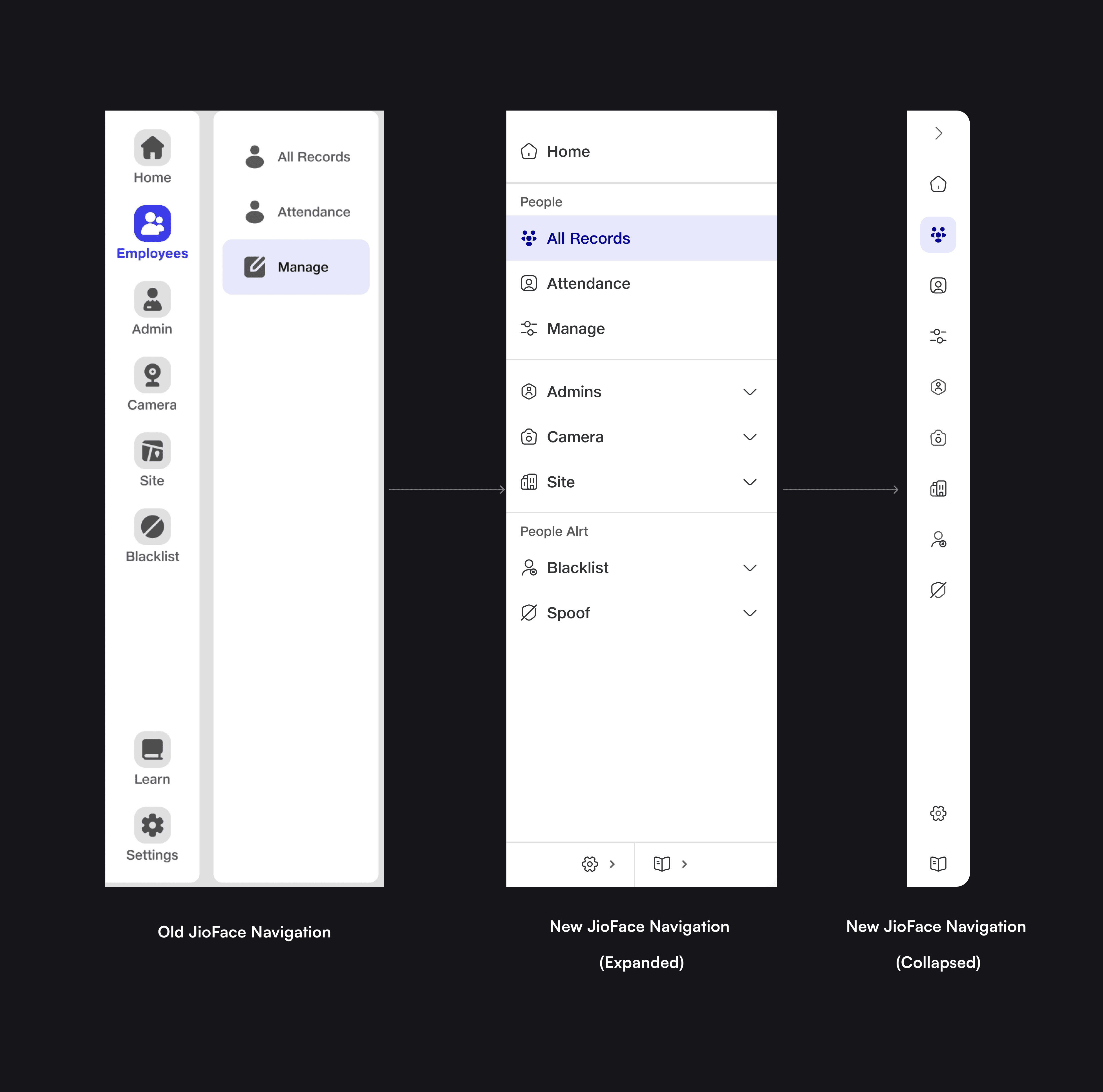

JioFace

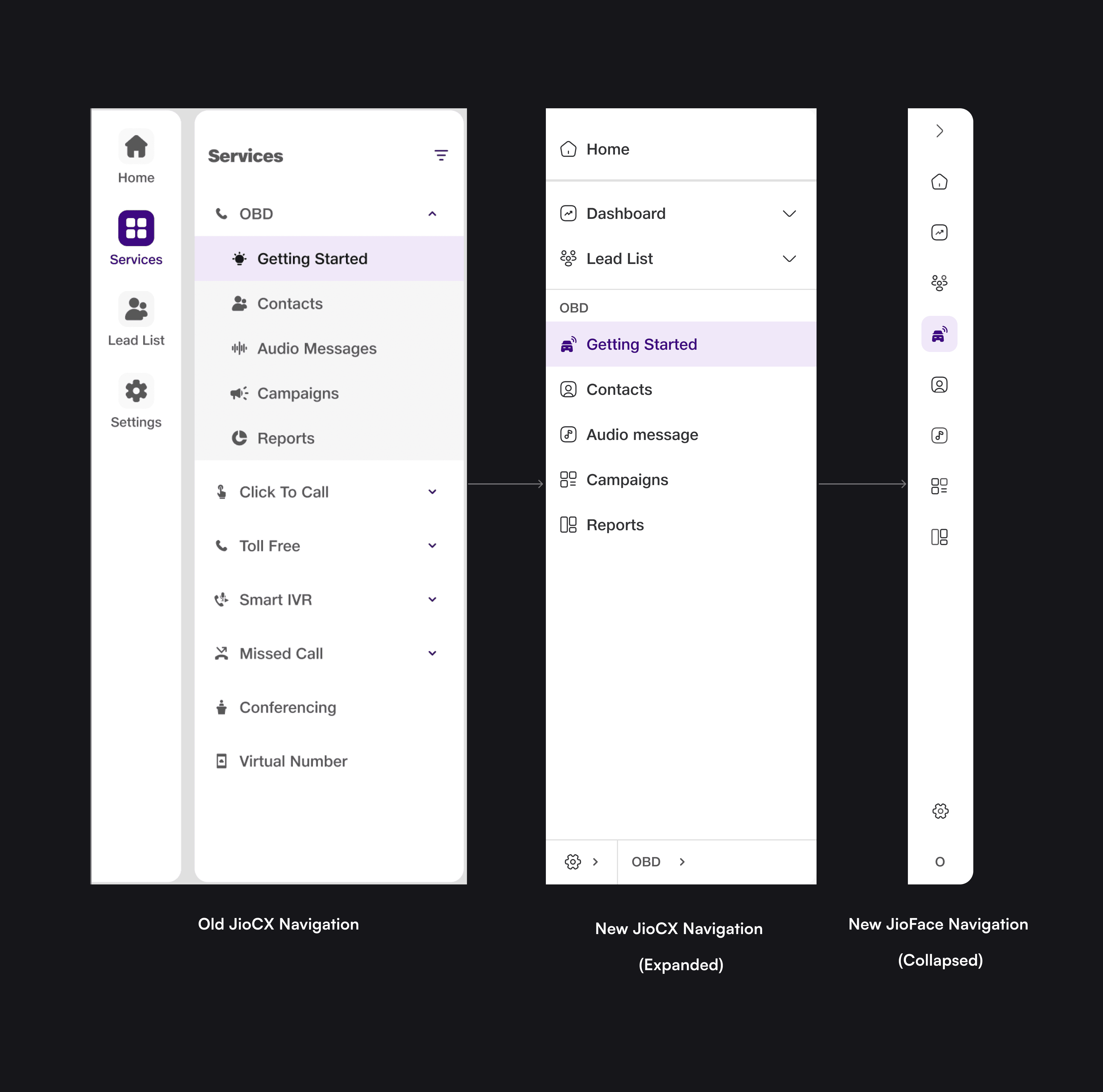
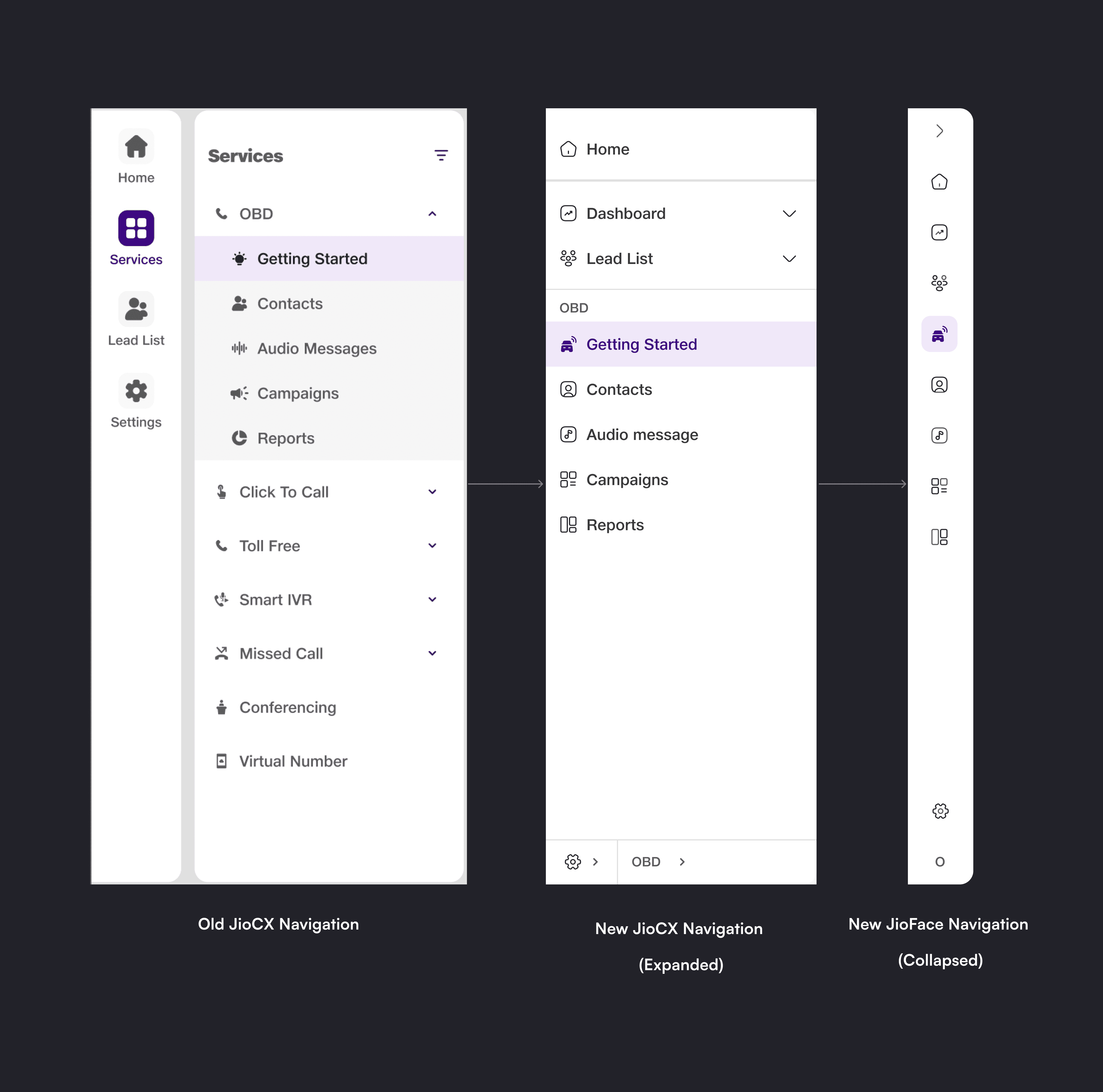
JioCRM
JioCRM was first new application where new navigation pattern implemented succesfully.
Impact
Results of user testing showed redesign of the navigation pattern positively impacted the user experience of all JET products. The case of JioCRM is noteworthy because we used a new navigation panel from the start of this product, and the response was excellent.
Enhanced User Engagement: JioCRM was a new application, and when we offered it to our users, they could use different features without any demonstration. It shows feature discoverability improved through navigation.
Streamlined Design Process- By designing components and guidelines for the side navigation bar, the design process for creating navigation was streamlined, resulting in a decrease in design time and increase in agility.
You have reached the end!
Throughout this project, I honed my design methodology and realized the significance of embracing each project's distinctive challenges. This journey underscored the collaborative nature of product design, emphasizing the iterative nature of refinement through feedback.
I hope you enjoyed reading it. Thank you!